Leave a comment at the end of this page or email contact@krishagni.com
Create and Edit Form
- Neha Nimgire (Unlicensed)
- Srikanth Adiga
- Priyanka Dange (Deactivated)
Who can create a form?
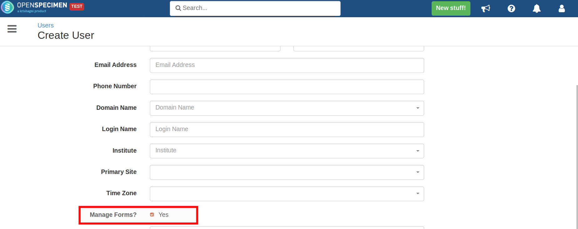
By default, super admins or institute admins can manage forms. To give this privilege to other users, select the 'Manage Forms?' checkbox on the 'Create User' page.
How to create a form?
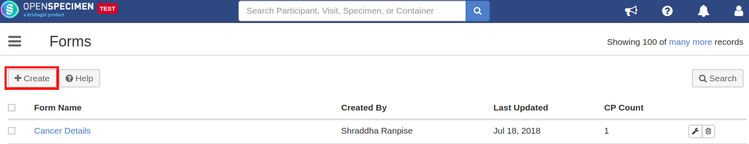
The user having the privilege on forms can create a custom form.
- Click on 'Forms' from the left side menu or from the home screen
- Click on 'Create' to create a new form
How to add controls to a form?
You can add multiple fields to a form using different controls.
- From the edit page of the form, click on 'Add/Edit Control'
- Select the desired control type
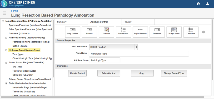
3. Provide all properties
Different Control Types:
Field Properties:
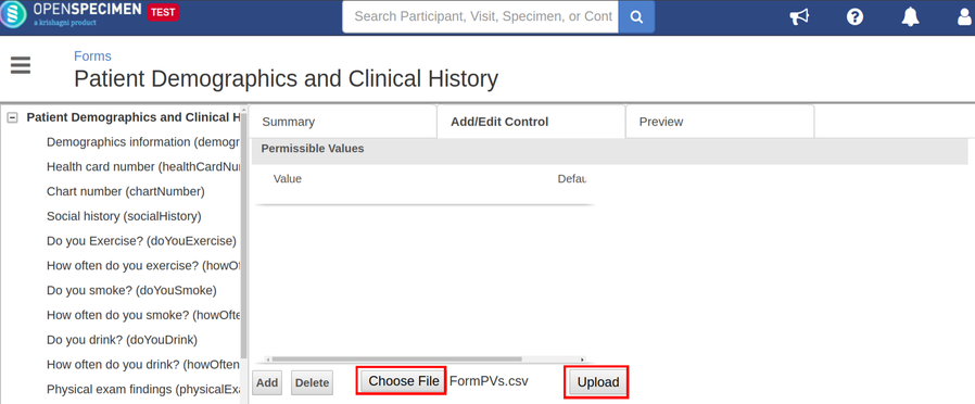
How to upload permissible values?
For the fields created using drop-down, radio button, multi-select, and check-box controls, you can add the permissible values manually or can upload the text or CSV file containing the permissible values. Follow below steps to upload PVs:
- Create text or CSV file of the permissible values to be added
- From the add/edit control page, click on the 'Choose File' button from the 'Permissible Values' section
- Choose the file of PVs to be uploaded and click on 'Upload' button
How to change control types?
User can the control type of the form fields e.g. change a dropdown field to multi-select field.
- Click on a field in the from the left side menu
- Click on 'Change Control Type'
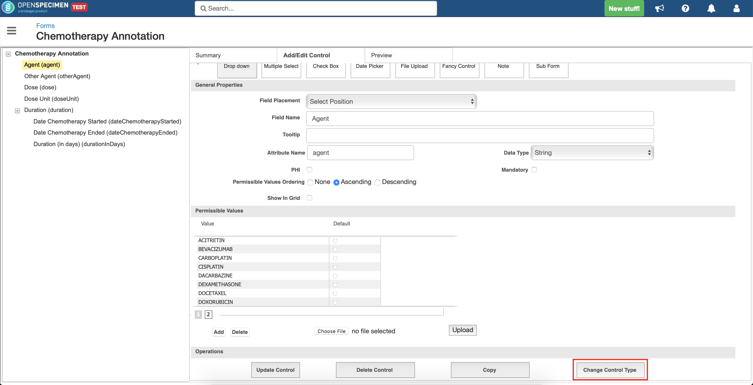
- A menu will pop-up to select the new control type for the field.
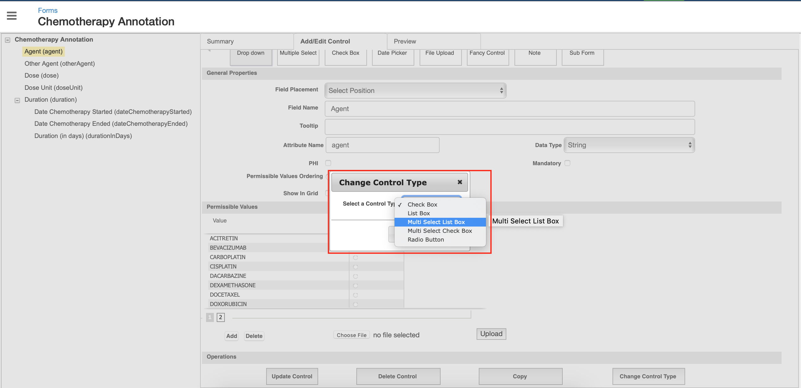
- Select 'Multi Select List Box' from the dropdown and click 'Ok'
- Click on 'Update' to confirm your actions for the field.
If collection protocol has a workflow configured with these fields defined in the dictionary section, you will have to change the control definition in the workflow as per the new control type selected in the UI.
More information on how to define the various control types: Attribute Types Examples
How to change the arrangement of fields?
User can change the placement of fields using the 'Field Placement' option.
- Go to the form to be edited and click on the field whose placement is to be changed
- On the right side, in the 'Add/Edit Control' section, click on the 'Field Placement' dropdown
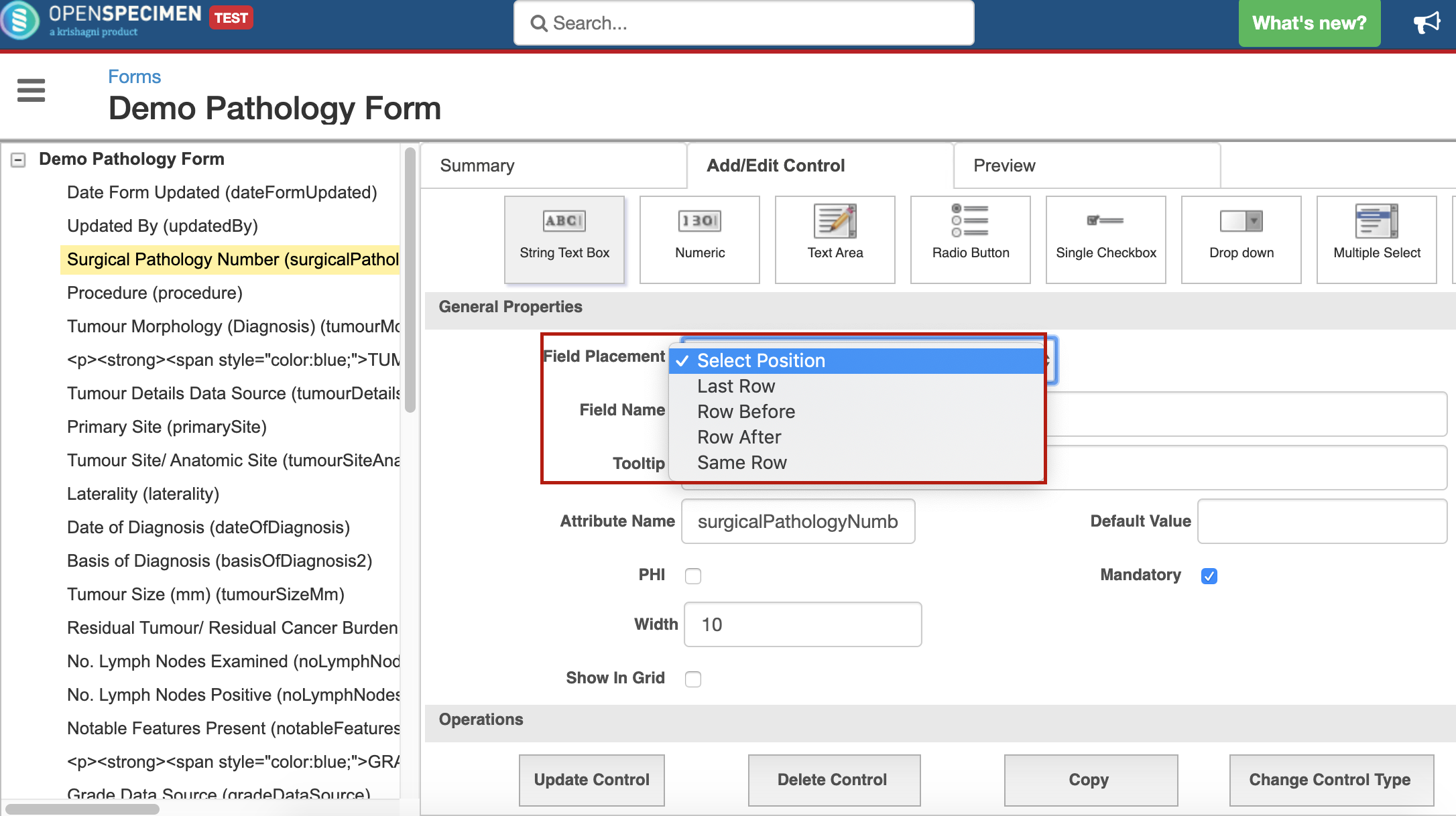
- Selecting one option from 'Row Before', 'Row After', 'Same Row' will display another field 'Select Control' beside this
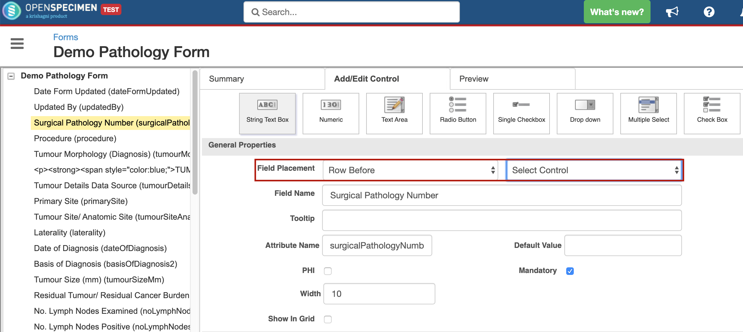
This will contain a dropdown with all the control names present in the form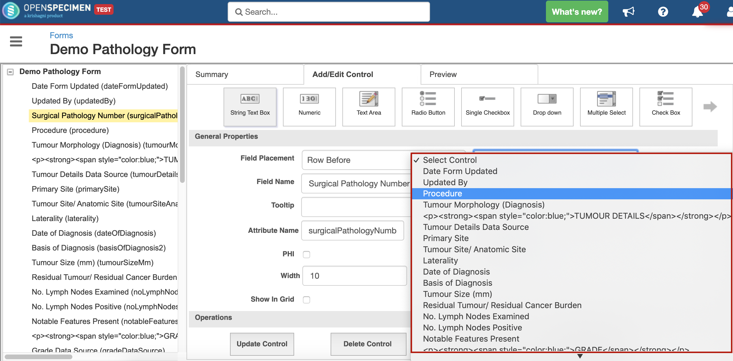
The above example will place the field 'Surgical Pathology Number' before 'Procedure' field - Click on 'Update Control' to save the changes.
- Selecting 'Last Row' option from 'Field Placement' dropdown will move the field to the last row, after all fields.
Subform fields ordering
Reordering fields within a subform is not supported via user interface. If you want to rearrange the fields wihtin the subform:
- Download the form in XML format
- Edit the XML to change the fields' order in the subform section
- Import it back. The subform fields might appear twice but once refreshed, the order will be reflected as per changes in the XML.
Leave a comment at the end of this page or email contact@krishagni.com