Who can create?
By default, super admins or institute admins can manage forms. Select the 'Manage Forms?' checkbox on the 'Create User' page to give this privilege to other users.

Create
If you have the 'Manage Forms?' privilege, you can create forms for your site, study, and so on.
Click on 'Forms' from the navigation menu or the home screen.
Click on '+Create' to create a new form.

Add the 'Title' of the form and click on 'Create'.

Add Controls
You can add multiple fields to a form using different controls as per your requirements.
To add new controls/fields to the form, click on ‘+ Add Field’.

Select the control type and click on 'Done'

Different Control Types
You can add a text field or text area field to your form to add URLs. URLs will be visible as hyperlinks on the overview pages upon data entry.
Note
MySQL DB restricts the number of fields supported in a table, so don’t create too long forms.
The number of fields supported depends on the data type of the fields. E.g., You can have 25-30 number fields in place of a single text field.
If the form is a mix of control types, please restrict it to not more than 75 fields.
Field Properties
Add Permissible Values under various field types
For fields like dropdown, radio button, multi-select dropdown, and checkbox controls, you can manually add the permissible values or upload the text or CSV file containing the permissible values. Follow the below steps to upload PVs:
Create text or CSV file of the permissible values to be added.
Click on the 'Edit' icon of the field that you want to upload PVs for.

Click on ‘Add Option’ to manually add values or click ‘+ Upload Options’ to add PVs using a CSV file.

When you export a form, the dropdown values are exported as separate CSV only if it has more than 15 values.
Add Permissible Values (From Dropdown Manager)
You can also use the PVs value available in the Dropdown Manager to add into your custom Field.
Click on '+ Add Field' and select 'Permissible Value'.
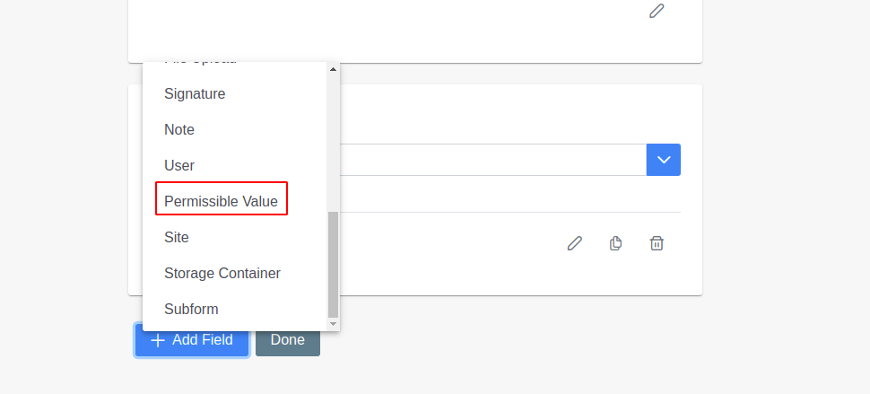
Add the field name of your choice → Select the dropdown value of your choice from the 'Dropdown' option → Save it.

Click on 'Done' to save the Form

Advantages of adding PVs using dropdown manager
Edit
You can edit any form field such as changing the display name, add more options to enumerated fields like dropdown, radio button, etc.
Navigate to 'Forms'.
Select the form you want to edit.
Click on the 'Edit' icon for the particular field that you want to edit.

Make required changes and save.

Rearrange Fields
You can drag the fields by clicking on the six dots and dropping them to the required position.

Preview
You can preview the form by clicking on the ‘Preview’ button present on the form overview page.

User can preview the form

Change Control Type (v8.1)
Below edits are supported from v8.1 for changing control types:
Radio button to dropdown and text field.
Dropdown to radio button and text field.
Checkbox to the multi-select dropdown.
Multiselect dropdown to the checkbox.
Create a form with different controls.
Click on the change icon.

The icon will only appear for the radio button, dropdown, multi-select dropdown, and checkbox fields.
Display Fields on Same Row (v8.1)
You can display similar fields on the same row like ‘Abdominal pain’ and ‘Pain location’ or ‘Do you smoke?' and 'How many times in a day?’.
When you add a new field/edit an existing field, you will see a checkbox 'Display on the same row as the last field'.
Checking the checkbox, you can add multiple fields in the same row.

To display the field in the same row as a field other than the previous field, first drag and drop the fields as required.
If you move a field that is part of fields in the same row, the line is broken. So you have to configure it again if you want it on the same line or a different one.
Delete field
You can delete any form field if not required any more.
Once the field is deleted, the previous data entered for the field is also deleted.
Navigate to ‘Forms’.
Select the form from which you want to Delete the field.
Click on the ‘Delete’ icon for the particular field you want to delete.
Click on ‘Yes’ on the pop window to confirm the deletion.
If any form field is deleted accidentally, then refer to the Undo Delete field link to revert the deletion.