| Properties | Description | Applicable to Control Type | Permissible Values |
|---|
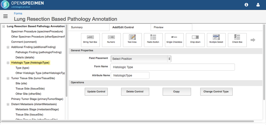
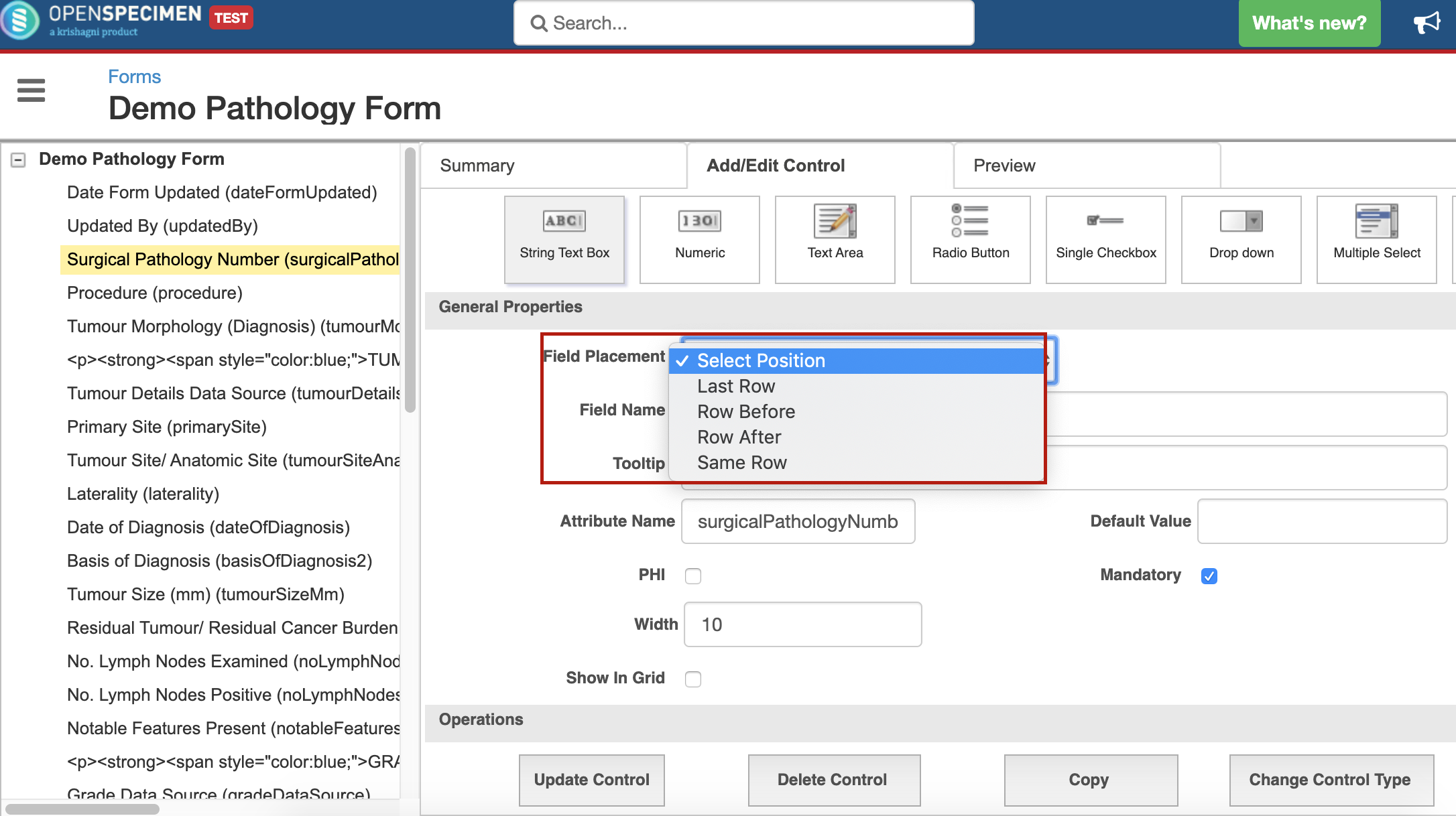
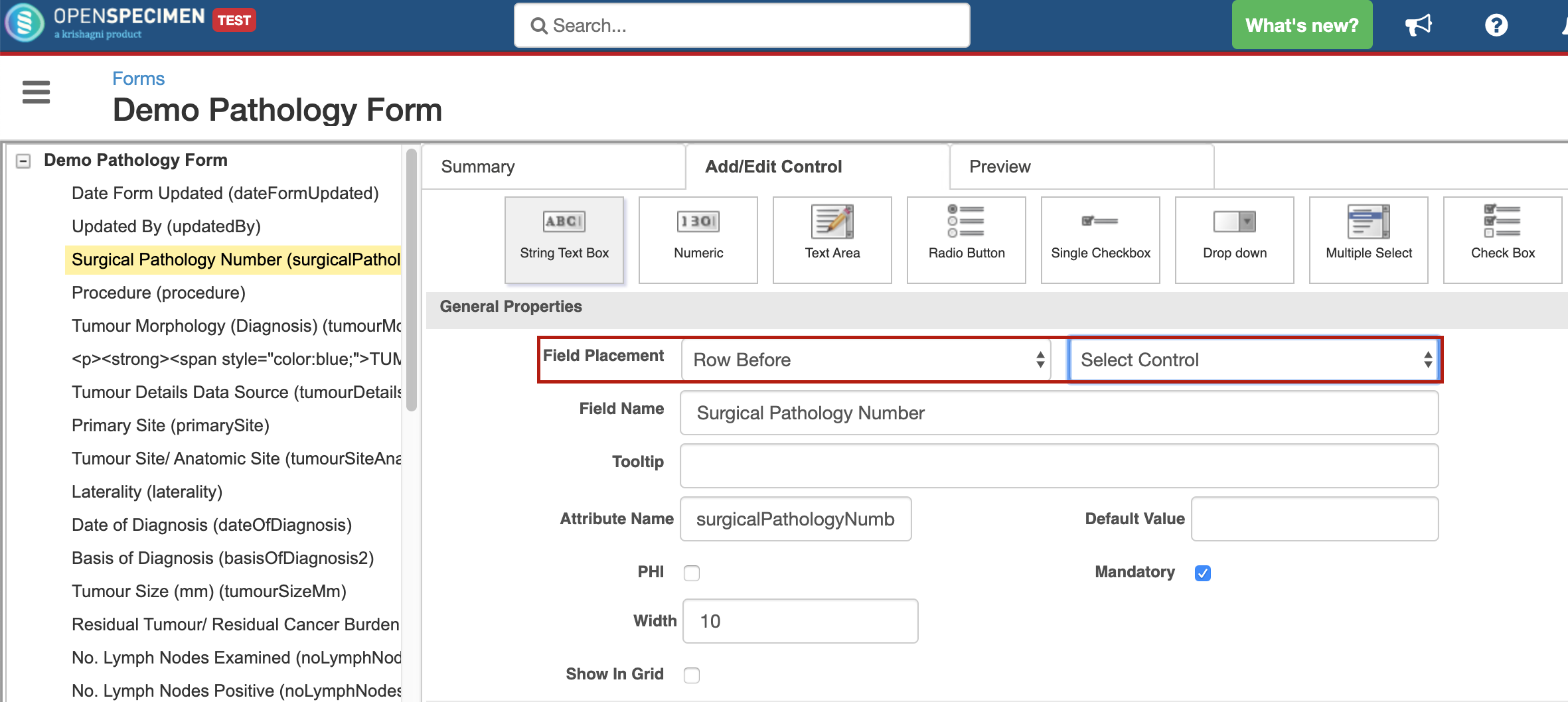
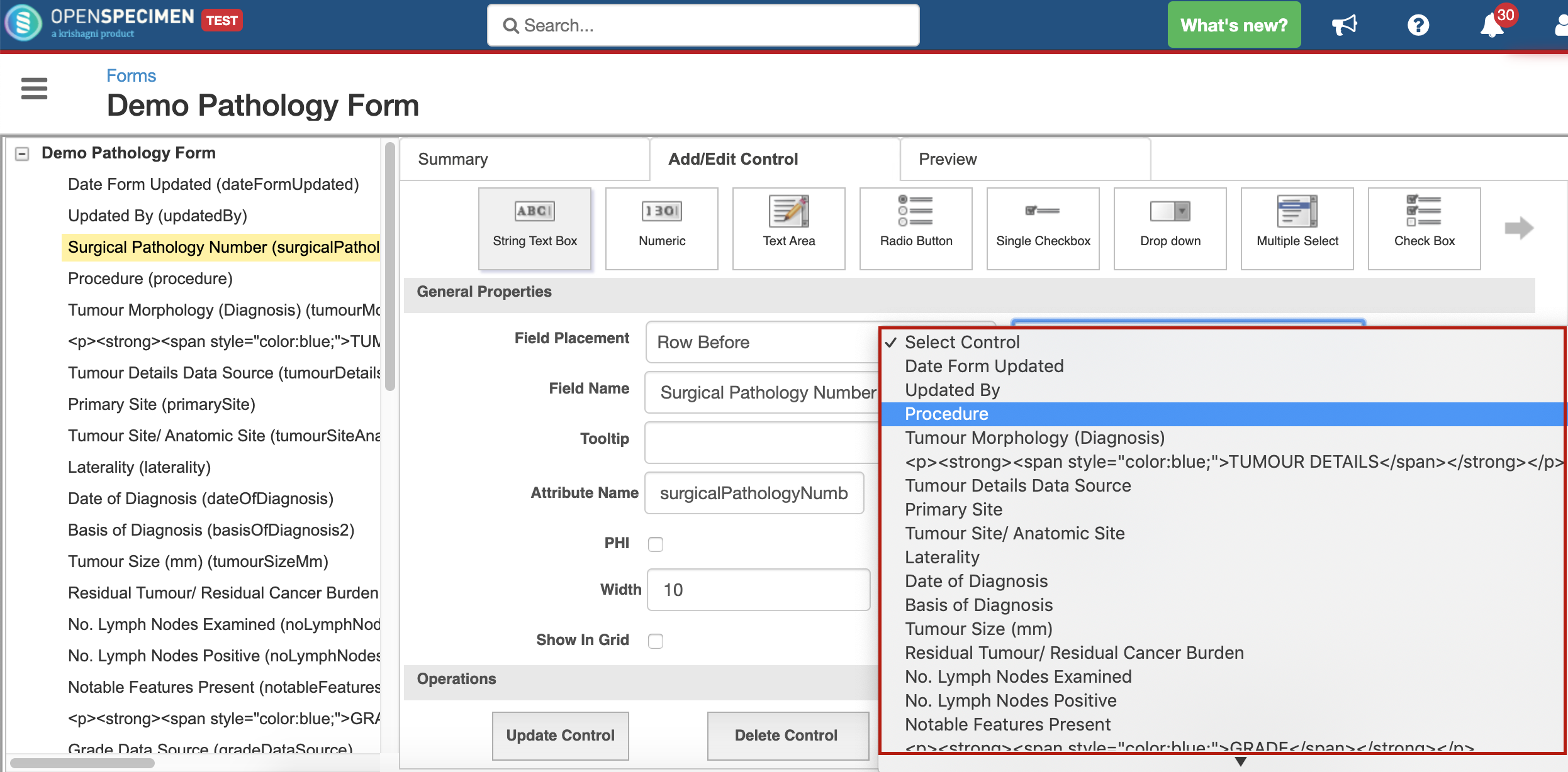
| 1 | Field Placement | The position of the field within the form | String Text Box
Numeric
Text Area
Radio Button
Single Checkbox
Drop-Down
Multiple Select
Checkbox
Date Picker
File Upload
Fancy Control
Note
Sub Form | Last Row Row Before Row After Same Row |
| 2 | Field Name | Name of the form field | String Text Box
Numeric
Text Area
Radio Button
Single Checkbox
Drop-Down
Multiple Select
Checkbox
Date Picker
File Upload
Fancy Control | The display name for the form field |
| 3 | Tooltip | Pop up displayed when the user moves the mouse over the field. Useful to set description or guidelines about the field to the user. | String Text Box
Numeric
Text Area
Radio Button
Single Checkbox
Drop-Down
Multiple Select
Checkbox
Date Picker
File Upload
Fancy Control |
|
| 4 | Attribute Name | System generated name | String Text Box
Numeric
Text Area
Radio Button
Single Checkbox
Drop-Down
Multiple Select
Checkbox
Date Picker
File Upload
Fancy Control
Note
Sub Form | Do not change this or blank it out |
| 5 | Default Value | Default value set for the field | String Text Box
Numeric
Text Area | For enumerated field types like dropdowns, radio button or list box, the default value can be set within the ‘Permissible values’ section. |
| 6 | PHI | Checkbox to make any field as ‘Protected health information’. This value will be hidden to users who do not have access to PHI. | String Text Box
Numeric
Text Area
Radio Button
Single Checkbox
Drop-Down
Multiple Select
Checkbox
Date Picker
File Upload
Fancy Control |
|
| 7 | Mandatory | To set the form field as required | String Text Box
Numeric
Text Area
Radio Button
Single Checkbox
Drop-Down
Multiple Select
Checkbox
Date Picker
File Upload
Fancy Control |
|
| 8 | Show In Grid | For forms in which level is set as ‘Specimen Event’, this attribute is shown in the events list under each specimen. | String Text Box
Numeric
Text Area
Radio Button
Single Checkbox
Drop-Down
Date Picker
File Upload
Fancy Control |
|
| 9 | Width | The width of the field | String Text Box
Numeric
Text Area |
|
| 10 | Minimum Value | Minimum value to be restricted for the field | Numeric |
|
| 11 | Maximum Value | Maximum value to be restricted for the field | Numeric |
|
| 12 | Number of Digits After Decimal | The number of digits to show after the decimal | Numeric | Set this to zero if you want only whole numbers like for ‘Age’. |
| 13 | Number of Rows | Number of rows to be shown in the text area | Text Area |
|
| 14 | Data Type | The type of the data to be accepted as an input. Based on this the search filters allows different operators. | Radio Button Drop-Down
Multiple Select
Checkbox | String Integer Float Boolean |
| 15 | Permissible Values Ordering | Sorting order of the values to be displayed within dropdowns, radio buttons etc. | Radio Button Drop-Down
Multiple Select
Checkbox | None Ascending Descending |
| 16 | Options Per Row | Values to be shown per row of the field | Radio Button Checkbox |
|
| 17 | Default Checked | Checkbox to make field checked by default | Single Checkbox |
|
| 18 | Format | The format of the date field | Date Picker | Date Only Date and Time |
| 19 | Default Date Type | Default date | Date Picker | None Current Date |
| 20 | Note | The read-only text displayed within the form. Can be used for headings or instructions in questionnaires. | Note | HTML tags such as <b></b> for bold, <i></i> for italics, <u></u> for underline etc. can be used. |
| 21 | Form Name | Name of the sub form | Sub Form |
|